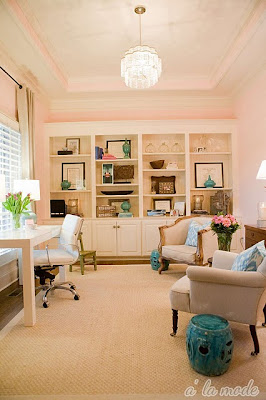
Every interior can benefit from a small dose of femininity. However, introducing feminine details into a space can prove to be challenging. I have heard from many fellow designers and bloggers who say they easily tire of anything too pretty.
By juxtaposing a softer element such as a floral sofa pillow or a pale blue cashmere throw with a weathered, farmwood coffee table or a clean-lined glass top coffee table, you can create a more dynamic and visually interesting space. This mix applies to your choices of color, textiles, furnishings, hardware, and accessories. Don't be afraid to play around with opposing combinations--a Louis XVI chair covered in pale, metallic pink paired with a mahogany library table, for example. Finding the right balance between masculine and feminine details is the key. Here are some spaces that are successfully feminine and not frilly:
 |
| Pale pink walls paired with a sleek, white Parsons desk (via Alamode). |
 |
| Billowy dress in artwork above a simple console table (Courtney Bishop's home via Design Sponge). |
 |
| Pink chaise with traditional gold accents (via Elle Decor). |
 |
| Pink walls and zig zag rug with sheepskin throw and Thonet chair (Making It Lovely). |
 |
| Louis XVI chair paired with a modern, white gourd lamp (Style at Home). |
 |
| Skirted ottoman with traditional George Smith sofa (Windsor Smith via House Beautiful). |
 |
| Antique Secretary with slipcovered chairs (Traditional Home). |


Hi, Kiley! Please feel free to link back to us at www.houseandhome.com. Thanks so much :)
ReplyDeleteSeema