When I was young, my mother and I would page through issues of
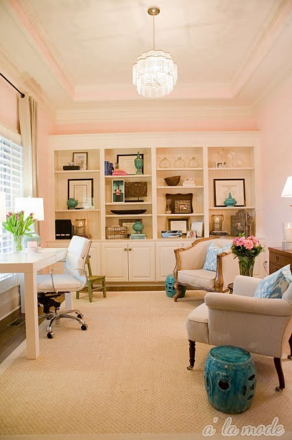
Architectural Digest or whichever shelter magazine she had lying around. As a collector of antiques, she always commented on how plain and boring and sparse the neutral rooms were to her, while I studied and admired these spaces. Even today, I prefer a room with neutral furnishings and pops of color in pillows, artwork, and other accessories. This allows for the instances of color to really stand out. It's very important to vary your shades of neutral. All beige will not keep the eye moving around the room. Layer in creams, whites, and taupes with beige.
Also, mixing in various metals, whether it be silver, gold, or bronze, livens the space through their reflective qualities. Personally, I prefer to combine various metals to keep the room from feeling too flat. Here are some examples of spaces that capture this look:
 |
| Pops of emerald green with black (via Better Homes and Gardens). |
 |
| Varying shades of turquoise in a kitchen (via Better Homes and Gardens). |
 |
| Colorful gourd lamp with mixed metal frames on the gallery wall (Carrier and Company). |
 |
| Using greenery to play up neutrals (Home of Emerson Made). |
 |
| Layering white with beige and taupe (House and Home). |
 |
| Softer shades of pink, blue, and yellow create their own neutral palette (Lonny Mag). |
 |
| Layering in shades of gray with pink flowers and throw pillows (Lonny Mag). |
 |
| Mixing metals (via Young House Love). |
 |
| Sunflowers pop in white room (Lonny Mag). |
 |
Earthy artwork and throw with neutral furnishings (via House Beautiful).
|