7.22.2011

Tablecloths

Shopping online is dangerous so much fun! Yeah I just did that really trendy, hilarious crossing out a word thing. Oh well.

My dining table has a ton of scratches and just general wear. I guess that's what you get when you buy a table from Target. The finish is so strange--you wipe your hand across it and a white smudge appears. You set something down on it for one second and it instantly leaves a mark. I'm tired of looking at it and worrying about making it worse.

That's why I'm thinking of buying this lovely tablecloth. Isn't it sweet?


Except that my table is only like 48"L x 30" W and this one is 70" x 108". Too big? I don't mind it being tabletop to floor but will it pool too much? I cannot do this whole find the right size tablecloth for your table. That's what wedding caterers are for!

I am not usually a fan of tablecloths or a lot of pattern, but I'm trying to embrace it. Besides, I have a lime green couch and this would go perfectly since the floor plan is open.

Did I just talk myself into buying this? I think so.

7.19.2011

New Bedding

I have been thinking about new bedding for awhile and came across this beautiful duvet from Pottery Barn which is on sale for $40!


I am wondering if anyone has bought bedding from PB and if you like it. We currently have a simple white coverlet and comforter but I wanted something with a little pop while still keeping it mostly neutral. I think the yellow border is lovely. It would be even lovelier paired with this West Elm pillow (the PB shams to match are on backorder until January 2012).


I also recently ordered this print which will go in the bedroom along with a few other botanical prints with mostly green leaves. The gray ikat pillows are currently on the bed. Any thoughts?


5.21.2011

How Sweet is Too Sweet?: Feminine Details in Interiors

Every interior can benefit from a small dose of femininity. However, introducing feminine details into a space can prove to be challenging. I have heard from many fellow designers and bloggers who say they easily tire of anything too pretty.

By juxtaposing a softer element such as a floral sofa pillow or a pale blue cashmere throw with a weathered, farmwood coffee table or a clean-lined glass top coffee table, you can create a more dynamic and visually interesting space. This mix applies to your choices of color, textiles, furnishings, hardware, and accessories. Don't be afraid to play around with opposing combinations--a Louis XVI chair covered in pale, metallic pink paired with a mahogany library table, for example. Finding the right balance between masculine and feminine details is the key. Here are some spaces that are successfully feminine and not frilly:


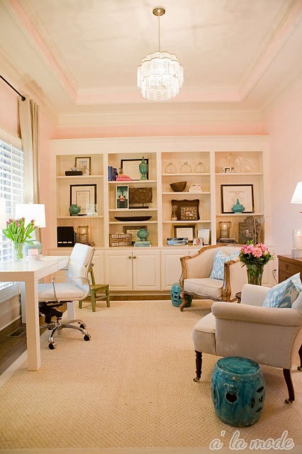
Pale pink walls paired with a sleek, white Parsons desk (via Alamode).

Floral wallpaper with a streamlined white cabinet (via Canadian House and Home).

Billowy dress in artwork above a simple console table (Courtney Bishop's home via Design Sponge).

Pink chaise with traditional gold accents (via Elle Decor).

Pink walls and zig zag rug with sheepskin throw and Thonet chair (Making It Lovely).

Louis XVI chair paired with a modern, white gourd lamp (Style at Home).

Skirted ottoman with traditional George Smith sofa (Windsor Smith via House Beautiful).

Antique Secretary with slipcovered chairs (Traditional Home).

Neutrals and Mixing Metals

When I was young, my mother and I would page through issues of Architectural Digest or whichever shelter magazine she had lying around. As a collector of antiques, she always commented on how plain and boring and sparse the neutral rooms were to her, while I studied and admired these spaces. Even today, I prefer a room with neutral furnishings and pops of color in pillows, artwork, and other accessories. This allows for the instances of color to really stand out. It's very important to vary your shades of neutral. All beige will not keep the eye moving around the room. Layer in creams, whites, and taupes with beige.

Also, mixing in various metals, whether it be silver, gold, or bronze, livens the space through their reflective qualities. Personally, I prefer to combine various metals to keep the room from feeling too flat. Here are some examples of spaces that capture this look:
 
Pops of emerald green with black (via Better Homes and Gardens).

Varying shades of turquoise in a kitchen (via Better Homes and Gardens).

Colorful gourd lamp with mixed metal frames on the gallery wall (Carrier and Company).

Using greenery to play up neutrals (Home of Emerson Made).

Layering white with beige and taupe (House and Home).

Softer shades of pink, blue, and yellow create their own neutral palette (Lonny Mag).

Layering in shades of gray with pink flowers and throw pillows (Lonny Mag).

Mixing metals (via Young House Love).

Sunflowers pop in white room (Lonny Mag).

Earthy artwork and throw with neutral furnishings (via House Beautiful).


4.25.2011

Old Lucketts Store Spring Market

The Old Lucketts Store in Leesburg is a fabulous place for vintage furniture, homegoods, garden furniture and accessories, and a whole lot more! I have been going to this store since I discovered it several years ago. It's a bit of a drive for me, but well worth it. The Spring Market is coming up May 21-22. Gates open at 10am and close at 5pm. Admission is $7 per person. Visit their site for more details: http://luckettstore.com/events/50-spring-market.


4.19.2011

Bookshelves: To Style or Not to Style?

I am quite certain this question has a long-standing and controversial history in the design world. I am honestly a bit tired of seeing all the styling of bookshelves in every blog, magazine, and journal I come across. This is not to say I do not enjoy a well-styled bookshelf, but it's just maddening for someone like me who is a writer and married to a writer. We have nine bookshelves and they are all filed with books! Books are stacked horizontally and others are vertical. We cram them in there!

Apartment Therapy did an amazing round up of floor to ceiling bookshelves. What I love about these images are the abundance of books! Sure I supposed they are still "styled" but they feel organic and they are not loaded down with nic-nacs and trinkets.

What do you all think? Do you prefer a wall of books or a more edited shelf mixed with objects and books?


4.01.2011

Waverly Fabric Giveaway from Bryn Alexandra

Hi all! Please be sure to stop over at Bryn Alexandra's blog to enter her giveaway for some great Waverly Fabrics, a Home Goods candle, and some fabulous botanical prints. Just look at all the fabulous prizes...


Bryn's blog is full of great DIY and her own home makeovers, which I personally love and is the reason I read blogs. I love her style, which is a little traditional and a little modern, and I appreciate how she brings in feminine touches while maintaining a kind of masculine edge, if that makes any sense. Meaning, it's not overly-girly. She also manages a shop in Charlotte, NC called Found. You can check it out here. 

Go and enter!